

Alabaster walls with Pure White trim is one of the most asked-about white-on-white combinations in Sherwin-Williams’ lineup, and for good reason. Both colors sit on the same fan-deck strip, both are popular on their own, and together they promise a soft, warm room with crisp, clean edges. But because the two whites are so close, a lot of homeowners worry the trim will simply disappear, or that one of them will look dingy next to the other.
This guide breaks the pairing down with the official Sherwin-Williams numbers (LRV, hex, hue and saturation), explains why the contrast is subtle but real, and walks through sheen choices, room-by-room advice, lighting, exterior use and the best alternatives if you want more or less contrast. If you are planning a calm, Scandinavian-leaning space, this is also one of the easiest “no-fail” backdrops you can choose.
Quick answer: Yes, Sherwin-Williams Alabaster (SW 7008) walls with Pure White (SW 7005) trim work well together. Pure White is slightly brighter and less creamy, so the trim reads as clean and fresh while the walls stay warm. The contrast is gentle, so use a higher sheen (semi-gloss or satin) on the trim and test both colors in your own light first.
Table of Contents
- Alabaster vs Pure White at a Glance
- Sherwin-Williams Alabaster (SW 7008) Explained
- Sherwin-Williams Pure White (SW 7005) Explained
- Does Alabaster with Pure White Trim Work?
- How Lighting Changes the Pairing
- Which Sheen to Use Where
- Room-by-Room Guide
- Alabaster and Pure White on the Exterior
- Other Trim Colors for Alabaster Walls
- Coordinating Colors and Accents
- Common Mistakes to Avoid
- How to Test Before You Commit
- FAQ
- Final Verdict
Alabaster vs Pure White at a Glance
Before getting into how the colors behave, here are the numbers. All values below come from the official Sherwin-Williams color pages for Alabaster SW 7008 and Pure White SW 7005.
| Spec | Alabaster (SW 7008) | Pure White (SW 7005) |
|---|---|---|
| Hex code | #EDEAE0 | #EDECE6 |
| RGB | 237, 234, 224 | 237, 236, 230 |
| LRV (light reflectance value) | 82.2 (usually listed as 82) | 84.0 (usually listed as 84) |
| Hue (per SW data) | 46.2 | 51.4 |
| Saturation | 0.05 | 0.03 |
| Fan-deck location | Strip 255, position C2 | Strip 255, position C1 |
| Color family | White & Pastel | White & Pastel |
| Interior / exterior | Both | Both |
| Overall feel | Soft, warm, creamy off-white | Clean, gently warm white |
Two details matter most. First, Pure White reflects a little more light (LRV 84 vs 82). Second, Alabaster carries a bit more color (saturation 0.05 vs 0.03), and that extra pigment leans warm. Put simply: Pure White is the brighter, “whiter” white, and Alabaster is the softer, creamier one. That small gap is exactly what makes trim look intentional instead of accidental.
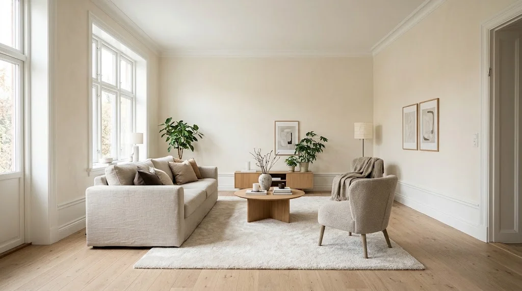
Sherwin-Williams Alabaster (SW 7008) Explained
Alabaster is a warm off-white that became a household name after Sherwin-Williams named it the 2016 Color of the Year. It has stayed popular because it solves a common problem: bright whites can feel cold and clinical, while creams can look yellow and dated. Alabaster lands in between.
Undertones
Alabaster’s undertone is warm, with a soft yellow-beige base and a slight gray softening that keeps it from turning into butter yellow. In warm afternoon light it can look noticeably creamy; in cool north light the gray side comes forward and it reads as a muted, gentle white. It almost never looks stark.
What LRV 82 means in real life
An LRV of 82 means Alabaster reflects most of the light that hits it, so it still brightens a room. But it is not at the top of the white scale. In a dim room it will look more like a light greige or cream than “white.” In a bright room it looks like a warm, cozy white.
Where Alabaster shines
- Living rooms and bedrooms where you want a calm, relaxed mood
- Open-plan homes where one color needs to flow through many rooms
- Spaces with natural wood, linen, wool and other warm textures
- Kitchens with white or wood cabinets and warm metal hardware
Sherwin-Williams Pure White (SW 7005) Explained
Despite the name, Pure White is not a pure, untinted white. It has a very small amount of warmth in it, which is why it plays so nicely with warmer wall colors. Compared with stark options such as Extra White, it feels softer; compared with Alabaster, it feels cleaner and brighter.
Undertones
Pure White’s saturation is very low (0.03), so its undertone is subtle. Next to a cool, blue-leaning white it looks slightly warm. Next to Alabaster it looks clean and neutral. That “chameleon” behavior is the key to the pairing: Pure White borrows a crisp look from Alabaster’s extra warmth.
Why designers like it for trim
- It is bright enough to frame walls without looking blue or icy
- It works with warm and neutral wall colors, not just whites
- It is also a common choice for cabinets, doors and ceilings, so one trim color can cover the whole house
Does Alabaster with Pure White Trim Work?
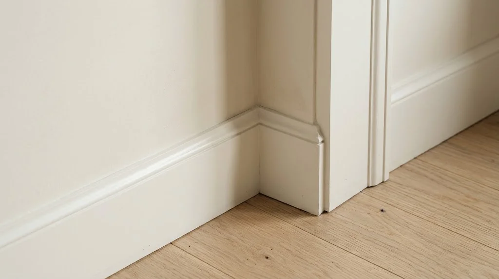
Yes. It is a low-contrast, “tone-on-tone” combination, and that is its main strength. Here is why two whites so close together still work:
- Different saturation, not just different brightness. Alabaster has more pigment than Pure White. Your eye reads the trim as the “cleaner” color even though the LRV gap is only about two points.
- Sheen adds separation. Trim is usually painted in a glossier finish than walls. The extra shine reflects light differently, which visually sharpens the edge between the two colors.
- Shadows do the rest. Baseboards, casings and crown molding cast small shadows. Those lines define the trim even when the colors are close.
- Same color strip, same family. Sitting next to each other on strip 255, they share a similar base. That is why the pairing looks related instead of mismatched.
The result is a room that feels soft and cohesive, with trim that looks fresh instead of yellowed. What you will not get is strong contrast. If you want trim to pop, choose a brighter white or paint the trim a darker color (see the alternatives section below).
Who this pairing is best for
- People who want a light, airy home that still feels warm
- Scandinavian, Japandi, modern farmhouse and transitional interiors
- Homes with lots of trim where high contrast would look busy
- Anyone selling or renting who wants a broadly appealing neutral
Who might want something else
- Fans of crisp, gallery-style contrast between walls and trim
- Very dark rooms with little daylight, where Alabaster can turn grayish-beige
- Rooms with strongly cool finishes (blue-gray tile, chrome everywhere) where warmth may clash
How Lighting Changes the Pairing
White paint is all about light. The same two cans can look very different from room to room, so think about your exposure before you buy gallons.
North-facing rooms
North light is cool and indirect. Alabaster will look softer and slightly grayer, and Pure White will look closer to it. The pairing still works, but the trim contrast becomes even quieter. Warm bulbs help a lot here.
South-facing rooms
Strong, warm daylight brings out Alabaster’s creamy side. Pure White trim stands out more clearly against it in these rooms, so the combination looks its best with southern light.
East and west-facing rooms
East rooms get bright, warm morning light and cooler afternoons; west rooms do the opposite. Expect Alabaster to swing between creamy and soft-gray through the day. Check your samples at the times you actually use the room.
Artificial lighting and bulb color
Bulb color temperature affects whites more than almost any other color. For this pairing:
- 2700K (warm white): cozy and creamy; Alabaster leans more yellow
- 3000K (soft white): the sweet spot for most living rooms and bedrooms
- 3500K to 4000K (neutral): clean and balanced; good for kitchens and bathrooms
- 5000K and above (daylight): can make Alabaster look flat and gray; best avoided in living spaces
Choose bulbs with a high CRI (90 or above) so whites look true. If you are planning new fixtures, our guide to the best smart lighting for the living room covers tunable-white options that let you dial in the exact warmth you like. You can also compare options in our roundup of smart light bulbs for the living room. If you still use older bulbs, our explainer on the incandescent light bulb shows why those very warm bulbs push whites toward yellow.
Which Sheen to Use Where
Because the colors are so close, sheen is your main tool for creating separation. A common, reliable setup looks like this:
| Surface | Color | Recommended sheen | Why |
|---|---|---|---|
| Walls (living, bedrooms) | Alabaster | Matte or eggshell | Hides wall flaws, soft look |
| Walls (kitchen, bath, hallways) | Alabaster | Eggshell or satin | Easier to wipe clean |
| Baseboards, casings, crown | Pure White | Semi-gloss | Durable, clear contrast |
| Interior doors | Pure White | Semi-gloss or satin | Handles fingerprints and knocks |
| Cabinets | Pure White | Satin or semi-gloss (cabinet enamel) | Hard, cleanable finish |
| Ceilings | Pure White or Alabaster | Flat | Hides imperfections and glare |
Satin vs semi-gloss on trim: Semi-gloss gives the most visible line between wall and trim, which helps this low-contrast pair. Satin looks more modern and hides small dents and brush marks better, but the trim will blend into Alabaster more. If your trim is older or has many imperfections, satin may be the better compromise. High-gloss is usually too shiny for most homes and highlights every flaw.
Ceiling tip: Painting the ceiling Pure White makes the room feel a little taller and brighter. Painting it Alabaster gives a cocooned, seamless look that works well in bedrooms and rooms with low ceilings.
Room-by-Room Guide
Living room
This is where Alabaster with Pure White trim feels most at home. Pair it with light oak floors, a linen or bouclé sofa, wool rugs and a few black or brass accents. In a Scandinavian-style living room the soft walls let wood and texture carry the design. For more ideas on layering a calm space, see our Scandinavian living room decor guide, and if your space is compact, our 22 square meter living room ideas show how light walls make small rooms feel larger.
Bedroom
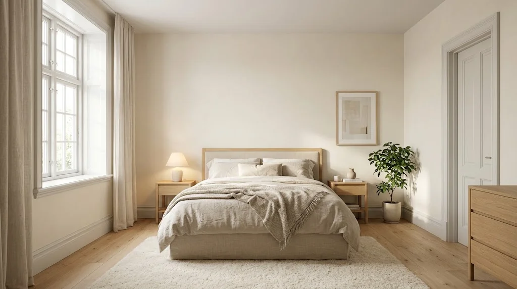
Alabaster’s warmth makes bedrooms feel restful. Use matte walls, Pure White semi-gloss trim, and consider an Alabaster ceiling for a soft, wrapped feeling. Warm 2700K to 3000K bedside lamps keep the room cozy at night. A natural wood or upholstered headboard looks great against it; our DIY headboard ideas include several that suit this palette.
Kitchen
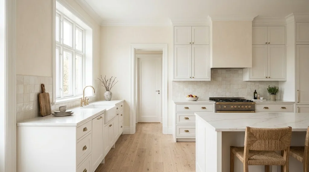
Alabaster walls with Pure White trim and cabinets is a classic kitchen look. Pure White cabinets read clean against the walls without looking stark. White quartz with warm veining, butcher-block counters, brass or matte black hardware and zellige-style tile all suit it. Avoid very cool, blue-white backsplash tile, which can make Alabaster look yellow by comparison.
Bathroom
Bathrooms often have cool tile and bright vanity lights, so test carefully. Use eggshell or satin on walls for moisture resistance and semi-gloss Pure White on trim and doors. Warm wood vanities, brushed brass or nickel fixtures, and warm-white bulbs around 3000K to 3500K keep the pairing balanced.
Hallways and entryways
Hallways often lack daylight, which can make Alabaster look duller. The bright Pure White trim and doors help lift these spaces. A satin finish on walls is worth it here since hallways get scuffed.
Open-plan homes
If you want one wall color and one trim color for the whole house, this pair is one of the safest choices. Alabaster is soft enough to flow through every room, and Pure White trim keeps every space crisp. It also gives you a neutral base if you like to switch decor styles; our guide on how to mix and match home decor styles is a good next read.
Renters
If you cannot repaint, you can still borrow this look with warm-white textiles, cream curtains and bright white accessories against existing walls. See our tips on decorating a rental apartment without painting.
Alabaster and Pure White on the Exterior
Both colors are rated for interior and exterior use, and the pairing can work outside, but sunlight changes things. Strong direct sun washes out most whites, so on a sunny facade Alabaster will look brighter and whiter than it does indoors, and the contrast with Pure White trim may almost vanish. On shaded or north-facing walls, Alabaster will look creamier and the trim will stand out a little more.
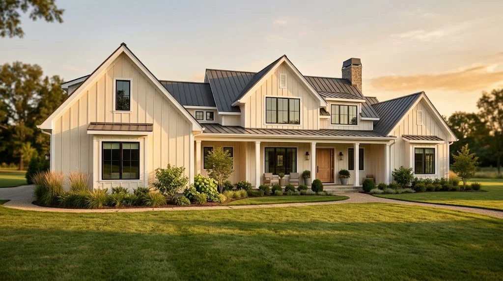
Tips for exterior use:
- Test large samples on more than one side of the house
- If you want visible trim outside, consider a darker trim or window color, such as Urbane Bronze or Iron Ore
- Alabaster is a popular soft white for stucco, brick and board-and-batten siding; if you have stucco, our stucco house guide covers maintenance worth knowing before you repaint
- Use a quality exterior paint line, and follow the product’s recommendations for primer and sheen
Other Trim Colors for Alabaster Walls
If Pure White does not feel right in your space, these are the most common alternatives. Data comes from the official Sherwin-Williams color pages.
| Trim color | LRV | Hex | Effect with Alabaster walls |
|---|---|---|---|
| Pure White SW 7005 | 84 | #EDECE6 | Soft, balanced contrast; the safe choice |
| Extra White SW 7006 | 86 | #EEEFEA | Crisper, cooler trim; makes Alabaster look creamier |
| High Reflective White SW 7757 | Very high (brightest SW white) | n/a | Maximum white-on-white contrast; can look stark in dim rooms |
| Alabaster SW 7008 (same as walls) | 82 | #EDEAE0 | Monochrome, seamless, very calm |
| Urbane Bronze SW 7048 | 8 | #54504A | Bold, moody contrast for doors or window frames |
| Iron Ore SW 7069 | 6 | #434341 | High-contrast, modern near-black |
Monochrome option: Painting walls and trim both in Alabaster (with a glossier sheen on the trim) is a growing trend. It looks very calm and makes rooms feel bigger, but it hides architectural details. It works best in modern homes with simple trim.
Coordinating Colors and Accents
Alabaster’s warm base makes it easy to combine with other neutrals and deeper accents. Here are reliable partners for walls in adjoining rooms, accent walls, cabinets or exterior details:
- Accessible Beige SW 7036 (LRV 58): a warm, light beige that flows naturally from Alabaster into adjoining rooms
- Agreeable Gray SW 7029 (LRV 60): a soft greige that pairs well for a slightly cooler adjoining space
- Urbane Bronze SW 7048 (LRV 8): warm, deep bronze for an accent wall, front door or kitchen island
- Iron Ore SW 7069 (LRV 6): soft black for window frames, doors or exterior shutters
- Muted greens: sage and olive-leaning greens look natural against Alabaster and add color without breaking the calm mood
Materials that work well: white oak and walnut, linen and cotton, jute and wool rugs, brushed brass, matte black metal, warm marble and travertine. Use with care: very cool gray tile, bright chrome everywhere, and blue-white fabrics, all of which can make Alabaster look yellow.
Finishing touches matter too. Smart devices, switches and speakers in white or wood tones blend into this palette; our list of smart devices for a Scandinavian living room includes options that will not clash with soft white walls.
Common Mistakes to Avoid
- Choosing from a tiny chip. White paint chips are too small to judge. Always sample on the wall.
- Testing on the old wall color. A sample painted over a yellow or gray wall will look different. Paint samples on white poster board or use large peel-and-stick samples.
- Using the same sheen on walls and trim. With two close whites, equal sheen can make trim look like a mistake. Go one or two levels glossier on trim.
- Ignoring bulb color. Daylight 5000K+ bulbs can make Alabaster look gray and dull.
- Leaving old trim unpainted. Yellowed oil-based trim next to fresh Alabaster looks dirty. Repaint trim at the same time, and use a bonding primer if the old paint is oil-based.
- Mixing too many whites. Cabinets, trim, tile and countertops in four different whites can feel messy. Keep Pure White as your single “clean white” and let Alabaster be the soft white.
- Skipping a second coat. Whites often need two coats for even coverage, especially over darker colors.
How to Test Before You Commit
Testing takes a few days but saves a lot of money and time.
- Get large samples. Use peel-and-stick samples or paint samples onto white boards about 2 x 2 feet.
- Place them correctly. Put the Alabaster sample on the wall and a Pure White sample right next to existing trim or a door frame, so you see them side by side.
- Check several walls. Test on the brightest wall and the darkest corner.
- Look at different times. Morning, midday, evening and at night under your normal lights.
- Live with it for two or three days. First impressions of whites are often wrong.
- Compare against your fixed elements. Floors, countertops, tile and large furniture will not change, so make sure the paint suits them.
FAQ
Is Pure White a good trim color for Alabaster walls?
Yes. Pure White (LRV 84) is slightly brighter and less saturated than Alabaster (LRV 82), so trim looks clean and fresh while walls stay warm. It is one of the most common pairings in the Sherwin-Williams lineup.
Will Pure White trim look yellow next to Alabaster?
Usually not. Alabaster has more warm pigment, so Pure White looks cleaner beside it. Pure White only starts to look warm when it sits next to a very cool, stark white such as Extra White.
Is the contrast between Alabaster and Pure White too subtle?
It is subtle by design. A semi-gloss finish on trim, natural shadow lines and a good light source make the difference visible. If you want strong contrast, consider Extra White or a dark trim color such as Urbane Bronze.
What sheen should I use for Alabaster walls and Pure White trim?
Matte or eggshell for walls in living areas, eggshell or satin in kitchens and bathrooms, and semi-gloss (or satin for a softer look) on trim and doors. Flat is best for ceilings.
Should the ceiling be Alabaster or Pure White?
Pure White in flat finish makes a ceiling feel brighter and higher. Alabaster on the ceiling creates a seamless, cozy look that suits bedrooms and rooms with low ceilings.
Can I use Alabaster and Pure White on the outside of a house?
Yes, both are rated for exterior use. Strong sunlight reduces the contrast, so test samples outside and consider a darker accent for windows or doors if you want the trim to stand out.
Does Alabaster work in a north-facing room?
It can, but it will look softer and slightly grayer. Use warm 2700K to 3000K bulbs and keep Pure White trim to add freshness.
Final Verdict
Alabaster walls with Pure White trim is a safe, flexible and good-looking pairing. The numbers explain why: Pure White is a touch brighter (LRV 84 vs 82) and less saturated, so trim looks clean while Alabaster keeps the room warm and inviting. The contrast is gentle, so lean on a glossier trim sheen, good lighting and proper testing to get the best result.
If you love calm, light-filled rooms with natural wood and soft textures, this combination is hard to beat. If you prefer crisp, high-contrast trim, try Extra White or a dark accent instead. Either way, sample first, check your light, and you will end up with walls you are happy to live with for years. For more ways to upgrade the space once the paint is dry, browse our best home tech upgrades for the living room.
Note: Paint colors look different on screens and in printed images. Hex and LRV values are from Sherwin-Williams’ official color data; always confirm with physical samples in your own lighting before buying.